
Staffie is a two-sided platform connecting F&B businesses looking for part-timers with a qualified network of staff (Staffie Pros) looking for work.
With any platform business model, the game is to constantly balance the levers between increasing supply or increasing demand. By creating value (matching & filling shifts) for both demand-side (business) and supply-side (Pros), the goal is to generate network effects—connect more users to more value, which in turn attracts more users.¹
¹ Platform Revolution, Geoffrey G. Parker, Marshall Van Alstyne, and Sangeet Paul Choudary.
Completion Date
September 2021
Category
Product Design
Sector
Food & Beverage, Technology
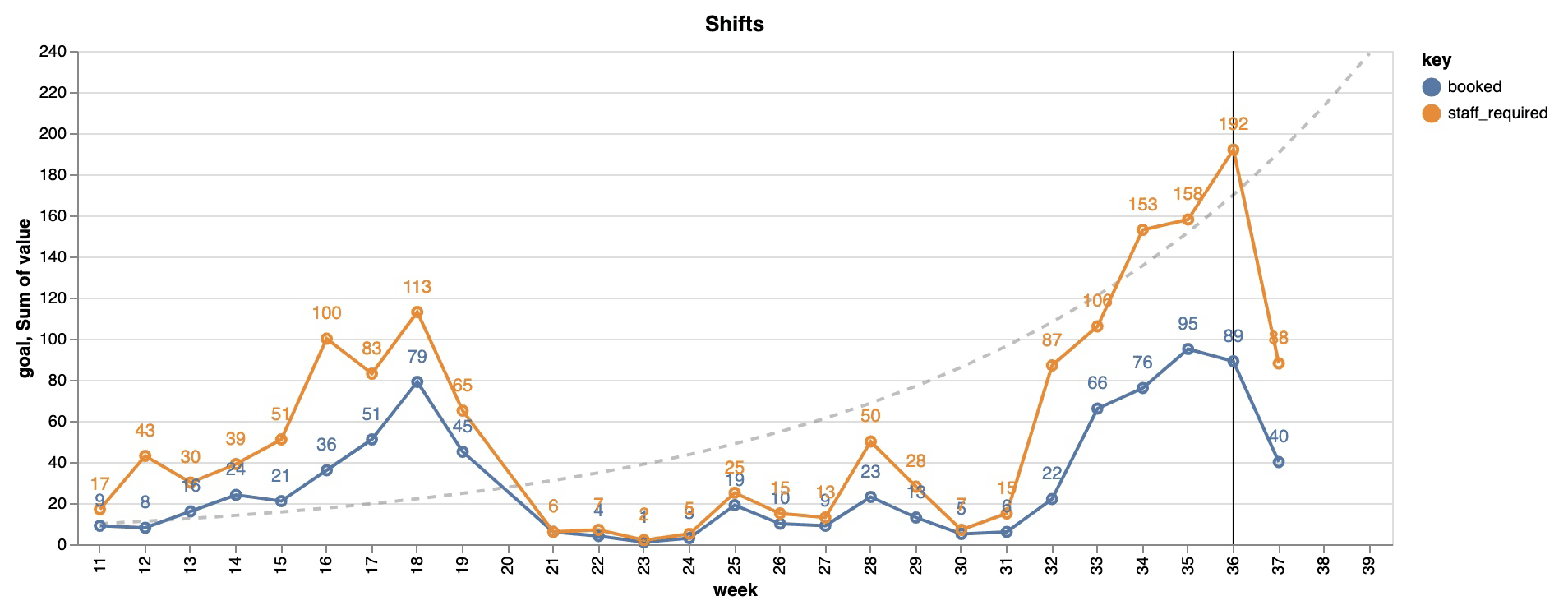
Graph comparing shifts posted (orange) and shifts booked (blue) week-on-week. Week 32 was right after the second round of lockdowns were lifted in August. At the time of recording, week 36 and 37 are still lagging indicators.
The problem
Since the easing of restrictions, more businesses have begun posting shifts with Staffie again, followed by increased Pro bookings.
Despite the uptrend, Staffie faced the challenge of becoming increasingly supply bound—as demonstrated by the graph above. As business demand for shifts increased, the supply of Pros booking shifts were not keeping up.
In the latter weeks, Staffie had >110 shifts posted on the platform, but only ~70 of them were successfully booked and filled.
Challenges
Staffie faced challenges in three areas of the acquisition and activation funnels, and each of them had its own set of existing issues.
➊
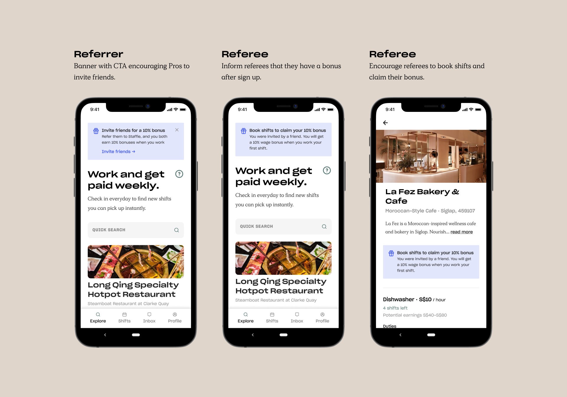
Increase Pro referrals
Since the time to first booking is usually >X days, Pros might not remember that they have a 10% wage bonus waiting.
The only time we clearly prompted Pros to refer their friends is during the signup process.
There’s no reliable way for Pros to track their referral earnings in the app. Some Pros have messaged us asking if their bonuses would be paid out.
➋
Improve onboarding
When we first added a “How it works” screen, it initially improved activation rate / time to first booking. However, we’d still get questions about payments—both before they book their first shifts and when awaiting their first payment.
We also had a Pro ask us how they might verify if Staffie is real, and that they wouldn’t end up working for free.
These indicate that there are still uncertainties about how Staffie works.

➌
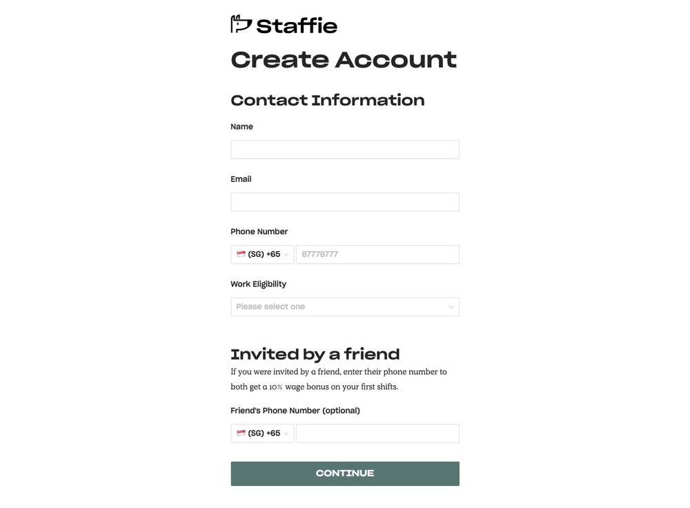
Reduce signup dropoffs
Of the leads who viewed the signup form, about 50–60% of them drop off before completing the first step.
The number of details asked within the first step may have been overwhelming.
The signup form was also one of the flows that we have not given due attention and improvements to since the first launch—as it worked fine until now.
User needs
Based on the challenges and the user feedback above, we can narrow down our user needs to:
➊
As a Pro, I need information on how to receive the 10% referral bonus
➋
As a Pro, I need clear instructions for adding a bank account and receiving payments
➌
As a Pro, I’d like to see available shifts quickly after signing up
Hypotheses
The user needs led the team to figure out ways to improve supply activation by tackling these low-hanging fruit. While we could throw more money at the top-of-funnel lead acquisition initiatives, these few ideas stand out as confident solutions we can apply to the mobile app.
➊
Increase Pro referrals
Pros referred by their friends would trust Staffie more, and are more likely to book a shift after signing up.
➋
Improve onboarding
Giving new users assurance on how the platform works may reduce time to booking their first shift.
➌
Reduce signup dropoffs
Increasing the number of lead conversions should positively impact downstream metrics.
The following sections expand upon the work done for each area ↓
➊
Increase Pro referrals
The small improvements needed to potentially increase referral rates were simple. I drew references from common apps that have a referral program and applied the same to the Staffie Pro app. This was a common pattern which does not require reinventing the wheel.
Following deployment, we’d need to measure:
% of referrals signed up each week
% of Pro activation segmented by referrals vs non-referrals
Features saved for later include:
Track referrals in their profile
Clarify instructions of how and when they can get their 10% wage bonus

➋
Improve onboarding
When first released, these onboarding screens were only accessible through a tooltip on the home screen. This was done as a quick fix.
To improve new Pro onboarding, we made sure these flows are presented once a new Pro completes the sign up process. The copywriting was updated to clarify the steps of adding bank account info, and when they’ll get paid.
Following deployment, we’d need to measure:
Reduced time to the first booking
Reduced support questions

Pro app. Onboarding screens shown after a successful signup.
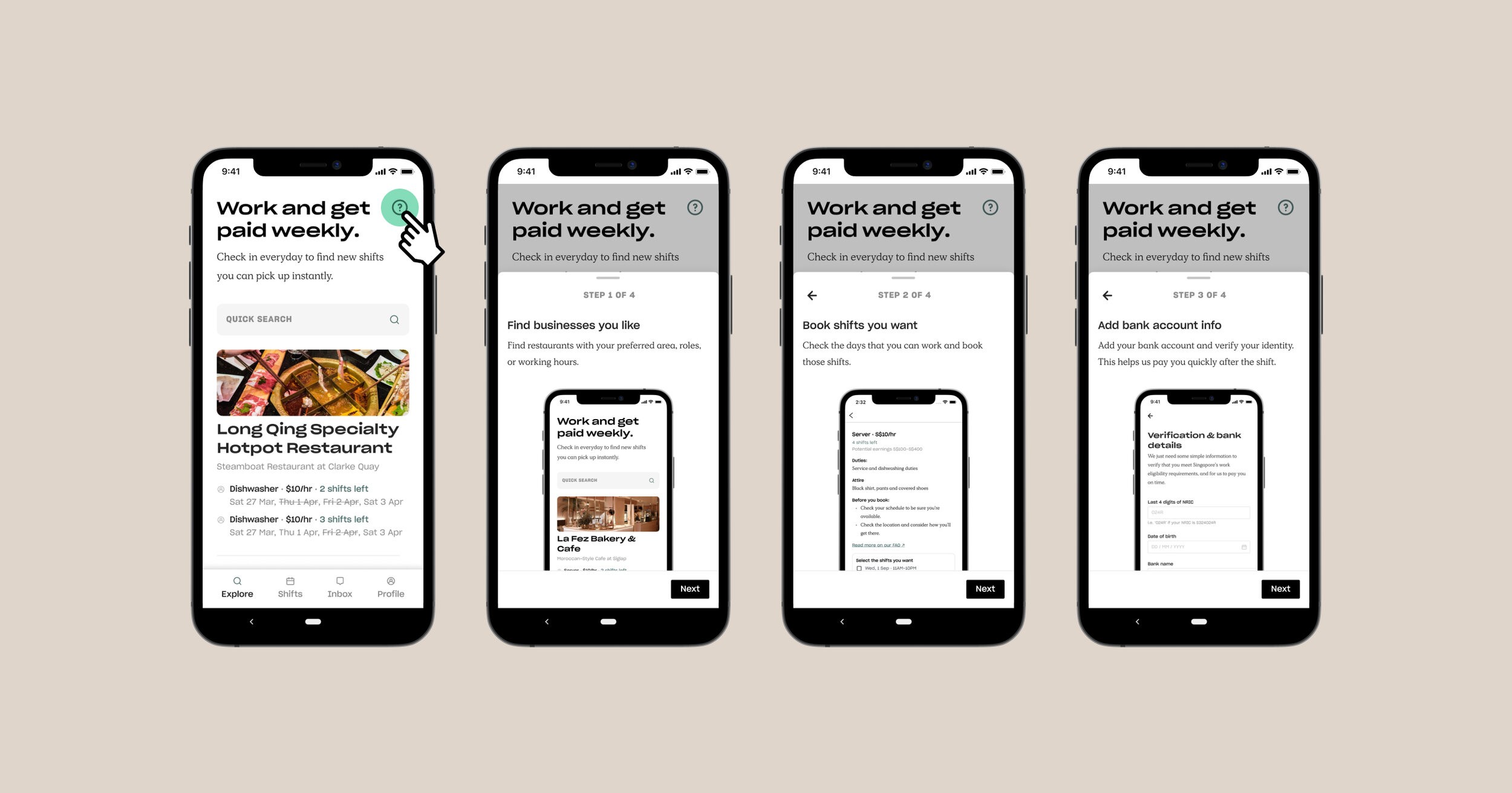
Pro app. The onboarding bottom sheets are now repeatable components that can also be accessed on the home screen tooltip.
➌
Reduce signup dropoffs
This initiative required the most thought, as it is an early touchpoint that impacts how well new leads sign up with Staffie.
I quickly spun up three different flow options for mobile based on our existing sign up form and other standard sign up patterns.
Having previously completed the groundwork of setting up master components and auto layouts in Figma, building the flows using these hi-fi screens were just as quick, if not faster than making a new set of lo-fi wireframes.²
² Granted, this shouldn’t be the default starting point—it really is case-by-case and depends on personal speed or thought process. It’s fine to break conventions as and when it’s needed.

Pro app. Signup flow options.
Option 1
Since the time to first booking is usually >X days, Pros might not remember that they have a 10% wage bonus waiting.
The only time we clearly prompted Pros to refer their friends is during the signup process.
There’s no reliable way for Pros to track their referral earnings in the app. Some Pros have messaged us asking if their bonuses would be paid out.

Option 2 ✨
When we first added a “How it works” screen, it initially improved activation rate / time to first booking. However, we’d still get questions about payments—both before they book their first shifts and when awaiting their first payment.
We also had a Pro ask us how they might verify if Staffie is real, and that they wouldn’t end up working for free.
These indicate that there are still uncertainties about how Staffie works.

Option 3
Of the leads who viewed the signup form, about 50–60% of them drop off before completing the first step.
The number of details asked within the first step may have been overwhelming.
The signup form was also one of the flows that we have not given due attention and improvements to since the first launch—as it worked fine until now.

The final choice: Option 2
Following discussions, we settled on building Option 2 first, as it was the simplest fix to the earlier stages of the signup funnel.
Splitting out the steps made it digestible enough for users, while the ability to skip adding work experience gives them the option of reaching the shifts page faster.
We decided to keep the explorations in Option 3 for later optimisation of steps like adding work experience. While the user creation steps are significantly shorter here, the general flow of the signup through to onboarding felt relatively lengthier.

Using Figma’s new auto-layout feature.
Results
As these were recently deployed at the time of writing, metrics will be updated shortly. Stay tuned.
Scope of Work
Product design
UI/UX design
UX writing
Product Design
Yung Tyng Lee
Development
En Lerk Law
Marx Low
