In May 2019, Workmate’s new tech team successfully completed their backend rebuild and migration from Odoo, an archaic ERP system onto Django. This set the product up to be far more scalable.
The new backend system was the tech team’s priority. Though we needed to pair the backend system with a new UI, the design of both the Admin Dashboard and Client Portal was made barebones for build and release speed. It let the engineers stay focused during those two crucial months.
As a result, we didn’t allocate as much attention to the design and usability of our platforms. They were functional at the bare minimum, and rightfully so, for the stage that the product was at.
This case study demonstrates the overall process of addressing the challenges we faced, and how I planned it from start to execution. For the minutiae of rules, colours, typography etc. — a recent version of the design system is viewable on Zeroheight.
Completion Date
December 2019
Category
Product Design, Design System
Sector
Workforce Management, Technology
The problems
Once the system was stable, we could get to work designing for our users. Our team grew with the addition of product managers and designers. It was time to get the product cycle rolling.
Over the next five months, we shipped new features to users upon the foundation of the new tech, but started running into recurring workflow problems:
➊
Difficulty in adding new features.
Trying to design new features into the existing products without a defined design system is like fitting a square peg into a round hole. We spent time more figuring out where to place things instead of knowing where they should fit.
➋
Design debt.
Inconsistent designs caused inconsistent user experiences. Our clients were faced with different placement of information and actions on different pages. It did not help them do their tasks easily, which also impacted the delivery of our value proposition.
➌
Inconsistent components.
Different UI libraries and lack of UI rules meant more time spent re-engineering similar components across the Client Portal and Admin Dashboard. Engineers also spent more time fixing design inconsistencies at the QA stage.
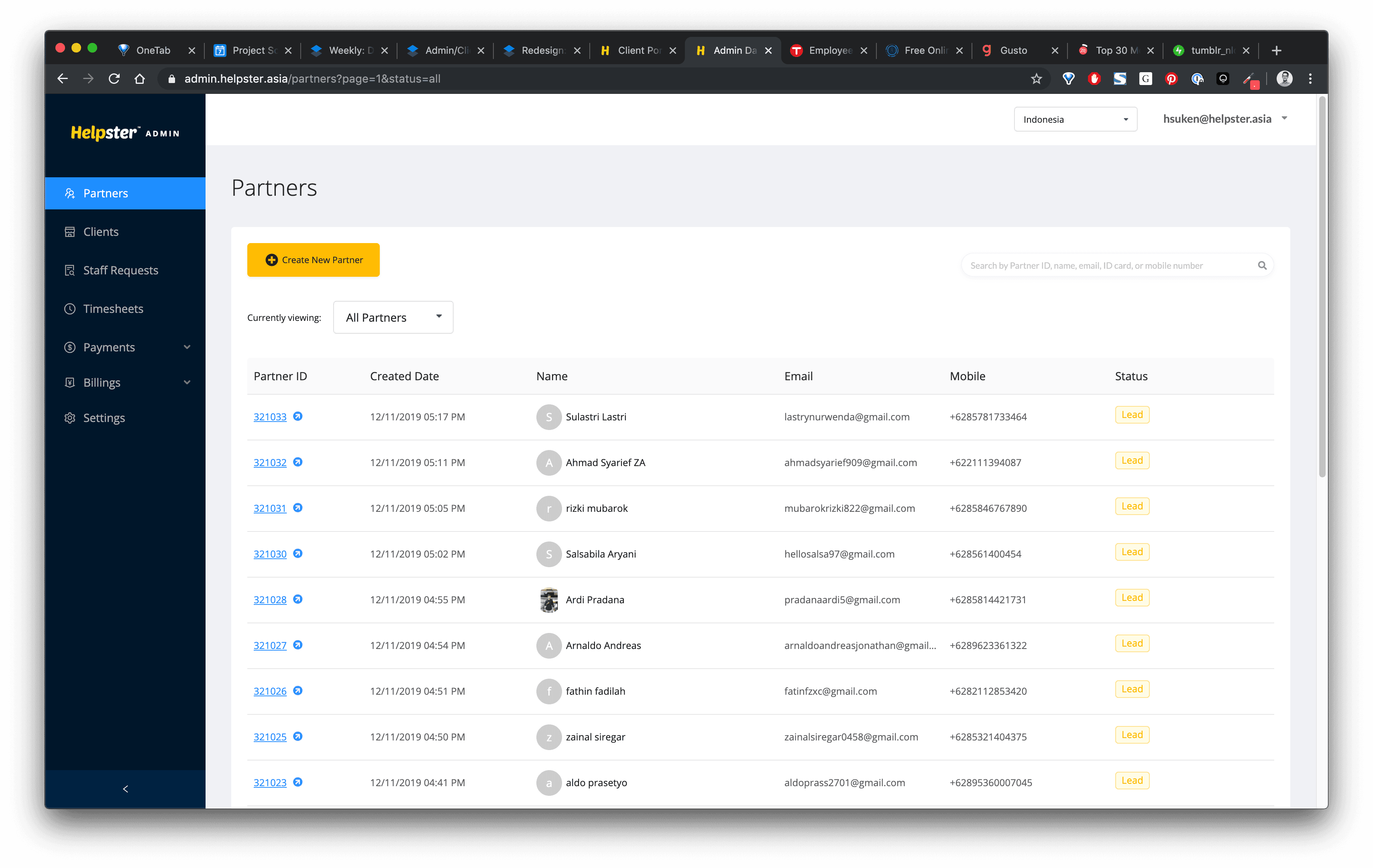
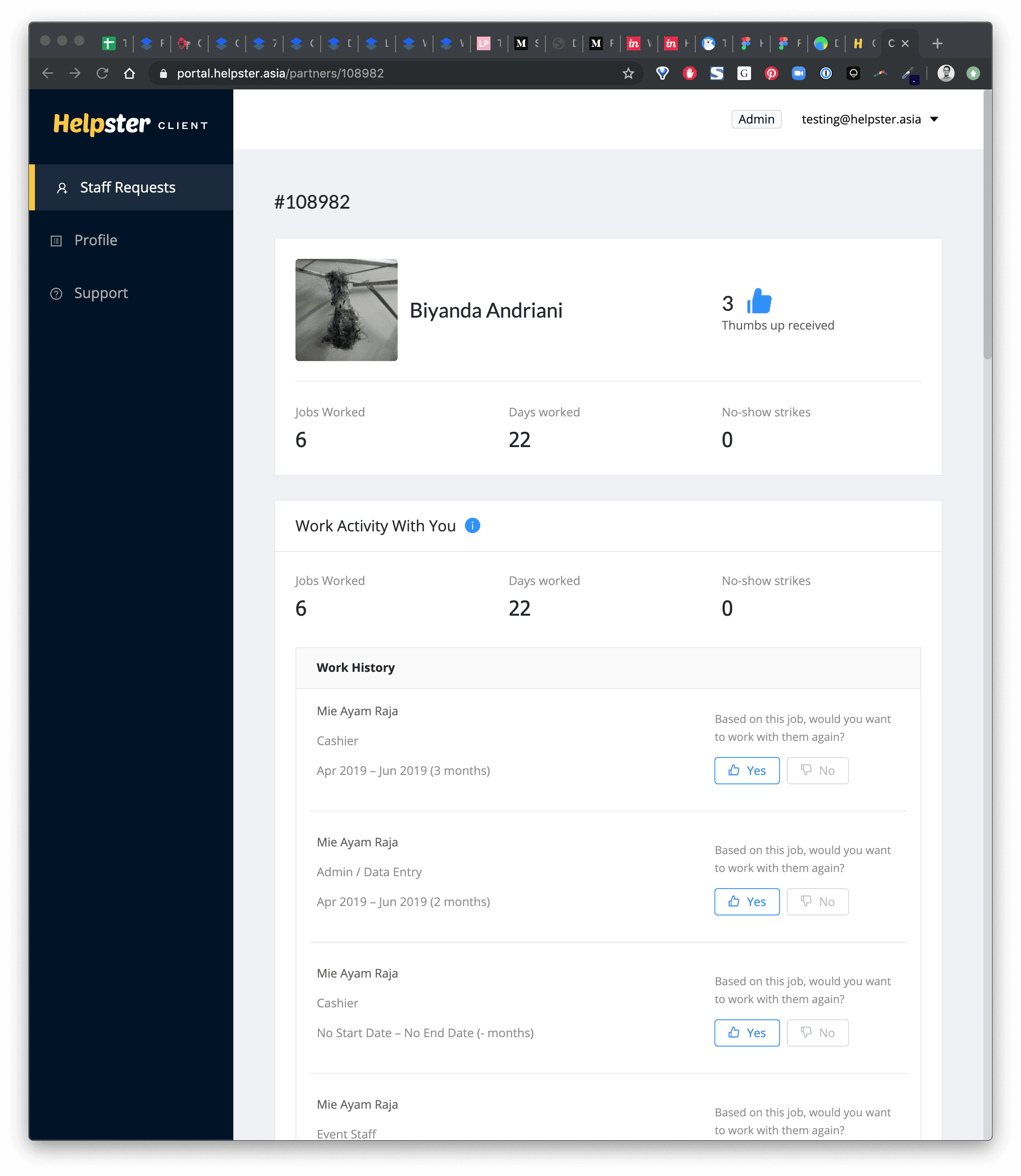
(Below) The original platform UI, when Workmate was still previously known as Helpster.


Hypotheses
Following discussions with the engineering team and our CPO, I drafted the obvious solutions to these problems:
➊
Design system & layout
A unified design system and visual language help us speed up design time. A well-thought info architecture means we know exactly where new features and info need to go.
➋
Clearing debt
Doing a redesign helps us clear compounded design debt at once, rather than spending one debt week per month making minor fixes.
➌
Shared UI components
Using a shared component library based on Atomic Design principles means that we can scale our feature design and builds a lot faster.
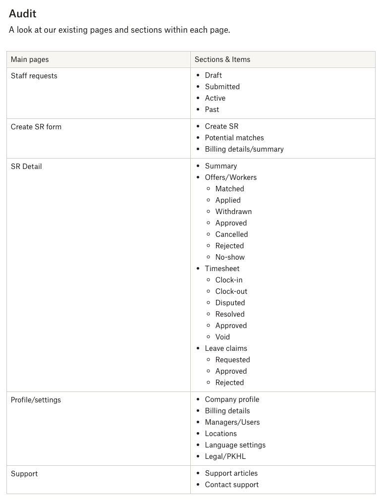
Audit
I started by quickly mapping out the current portal as a simple list and a sitemap. This gave us a quick sense of how much work was involved.
Rather than getting lost in the weeds at the early stage—this simplified mapping allowed me a bird’s eye view. It was clearer to point out which pages or flows would share common layouts and elements.

To the drawing board
Now confident with our scope, our CPO and I brainstormed and shaped up rough layouts based on common platform design patterns.
We limited ourselves to sketching only four main pages of the portal so that our focus was kept at a high level. The consensus for the primary layout would be — a primary column for content, a secondary column for contextual items, and a top bar for navigation.


Zooming in
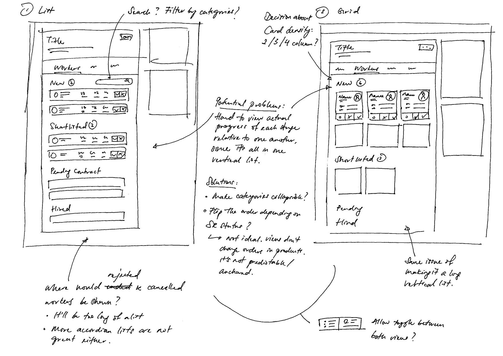
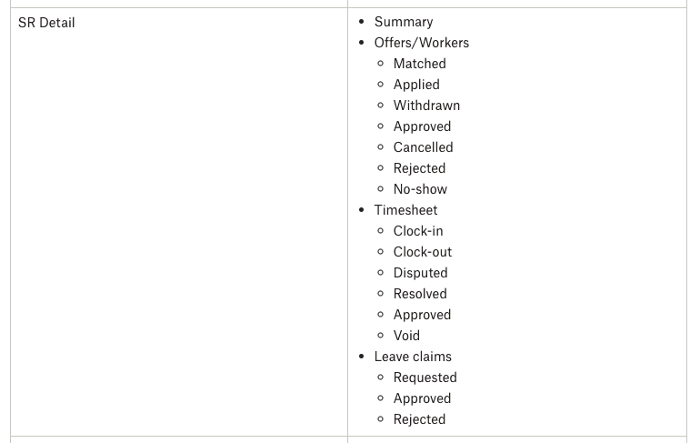
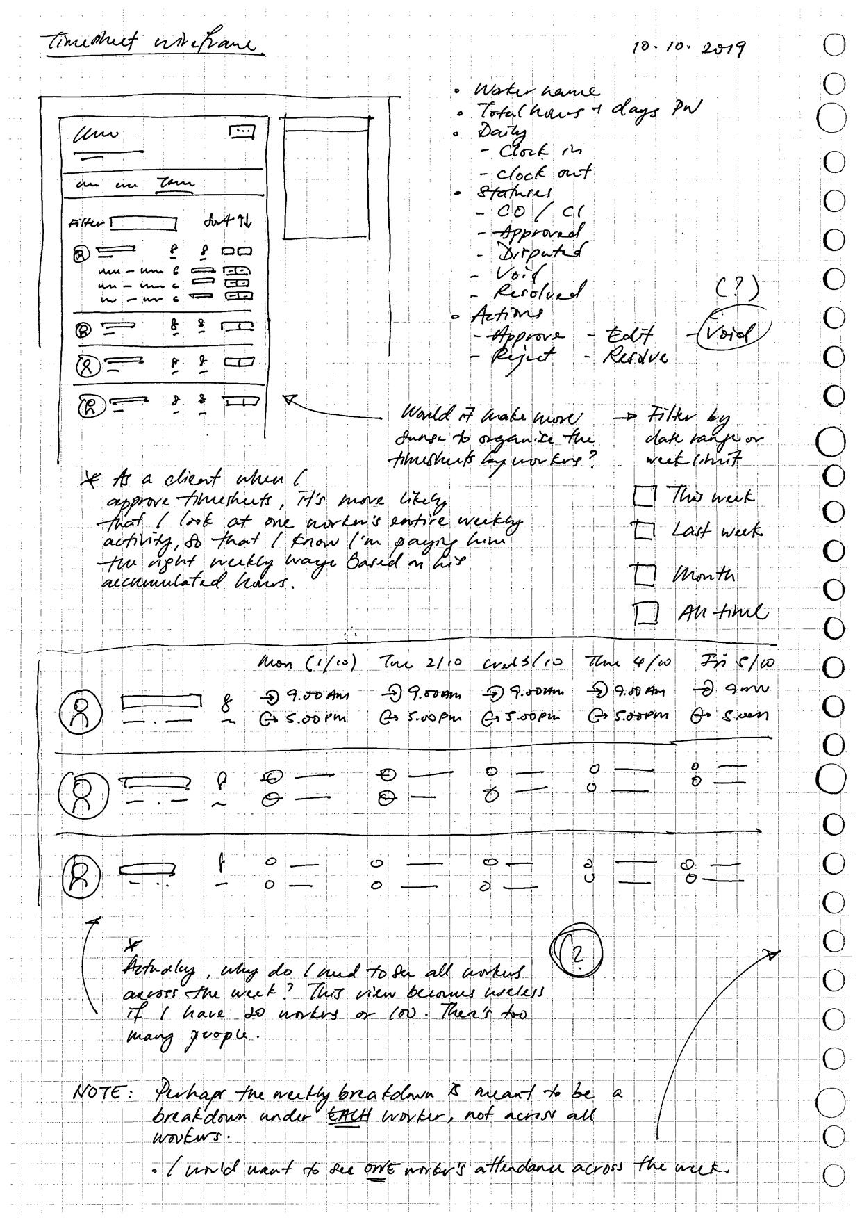
Once the overall page structure was set, we were zoomed into the details for each page type. I sketched at an increased fidelity for main portal pages such as:
Worker profiles
Staff request pages
Timesheets
For each section, I applied the same framework of
Sketches
Audit lists
Researching other products
Worker profiles
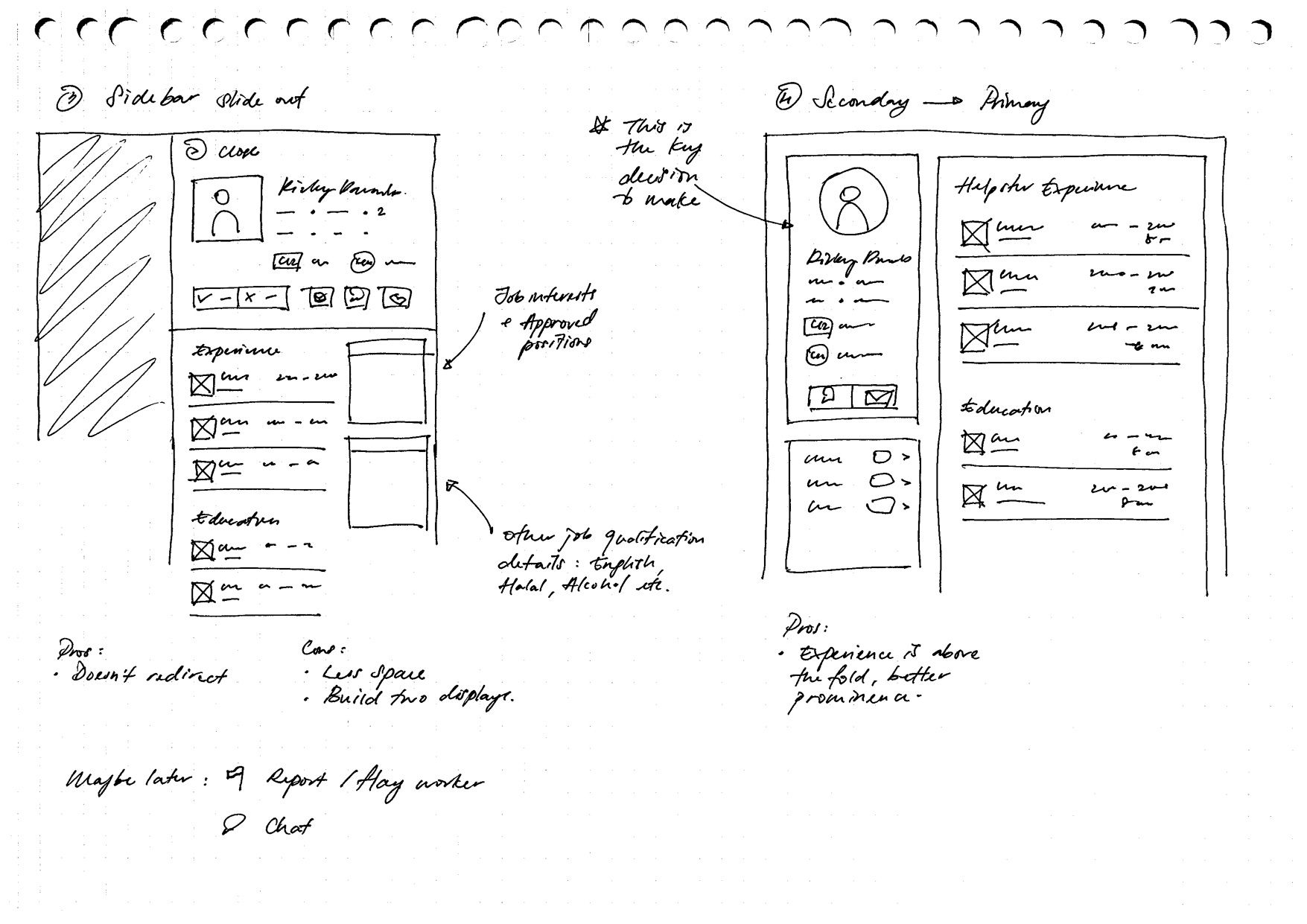

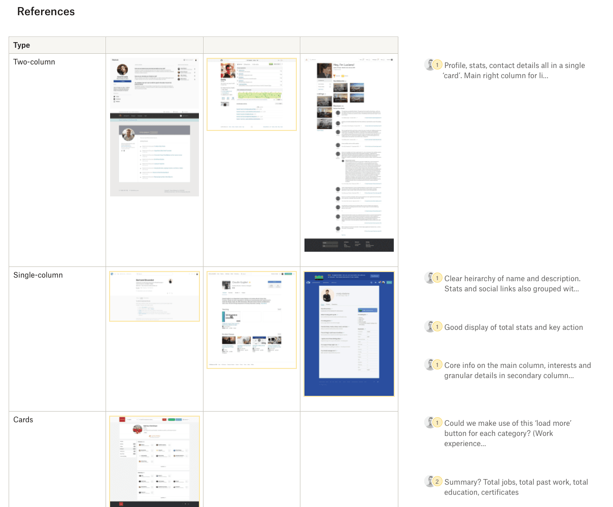
Staff requests


Lo-fi → Med-fi
Once we were confident that the layout worked with all major pages, I tested them as wireframes.

User feedback
Next, we walked through these wireframes with our internal Operations team and Head of Ops. They were the most active users of our Admin Dashboard. If these wireframes worked for their daily tasks, then the simplified client portal would work for our end users—which we would gather feedback for later.
We gained these key points for improvement from our sessions.
➊
Action focused
It’s important to give more prominence to actionable tasks and prompts like “Worker A isn’t clocked in today”, “New worker leads this week”, or “Unfulfilled staff request starting next week” etc.
➋
Fulfilment info
It’s more useful to get information about the health of a Staff Request, instead of just basic information like titles and locations. Keep users informed about fill rates, no-show rates, current clock-ins etc.
➌
Viewing density
A tighter, tabular view helps give a wider view across multiple staff requests or clients at once. This helps them compare and determine which things are a higher priority.
Next steps
With the groundwork laid, we planned our build order. After weighing our options, the team agreed on rolling out the new UI on the Admin Dashboard first, followed by the Client Portal. This gave us the benefit of:
➊
Active testing
By rolling out new designs internally first, we have active users giving us feedback.
➋
More iterations
We iterate from the feedback, and by the time we release the new UI to clients, we’re certain that it’s been de-risked.
➌
Close the gap between internal teams and clients
Internal teams get to be familiar with client-side features, because they’ve already used it themselves.
Timeline
With our wireframes tested and roadmap decided, it was time to execute. With one of our Product Manager’s help, I worked with him to plan a reasonable timeline and queue items into the development sprints.
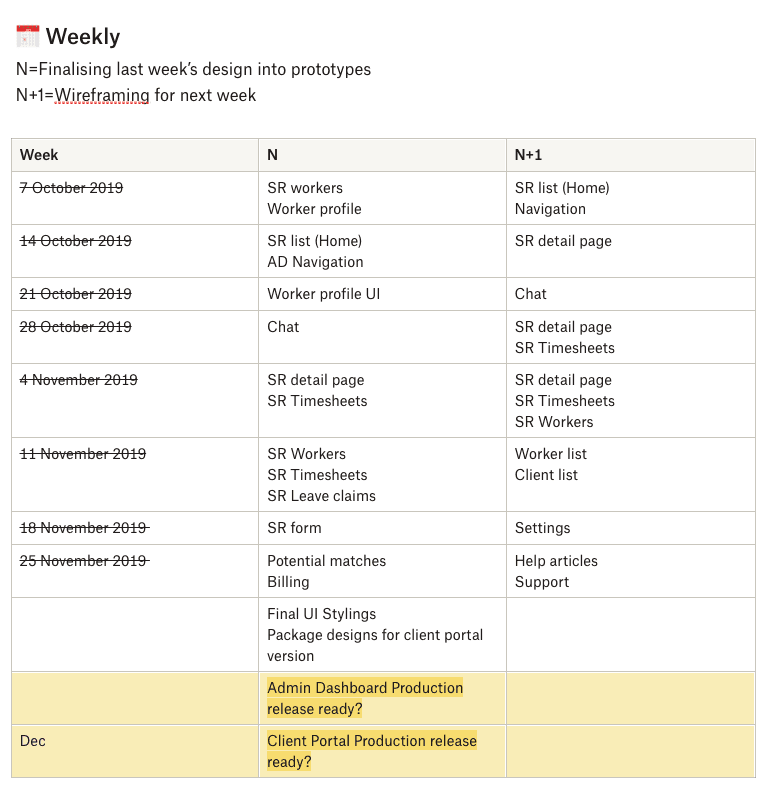
Sprint tracking
We kept our high-level timeline on a central project document, while individual tasks were broken down by the engineering team and tracked in Asana.
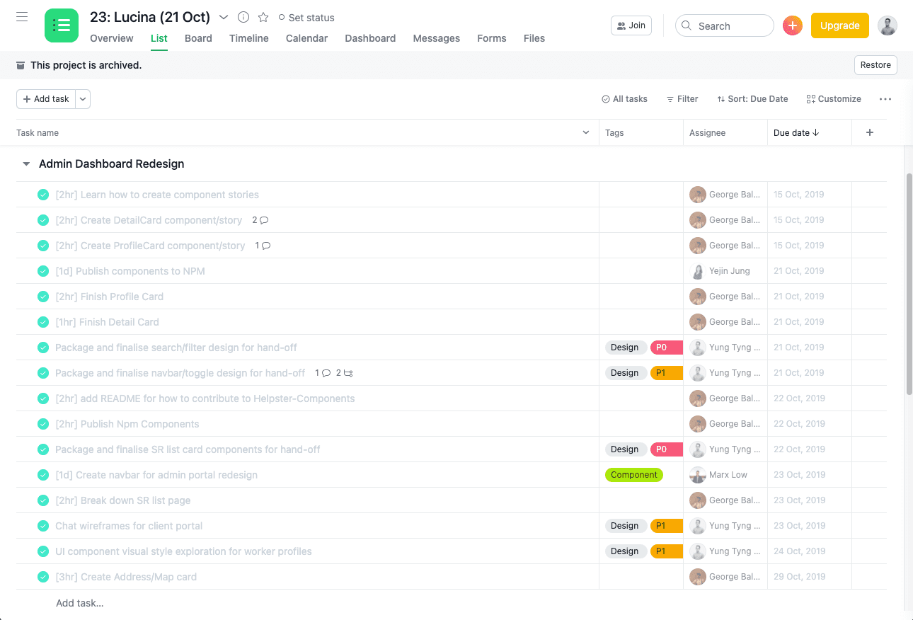
Project management
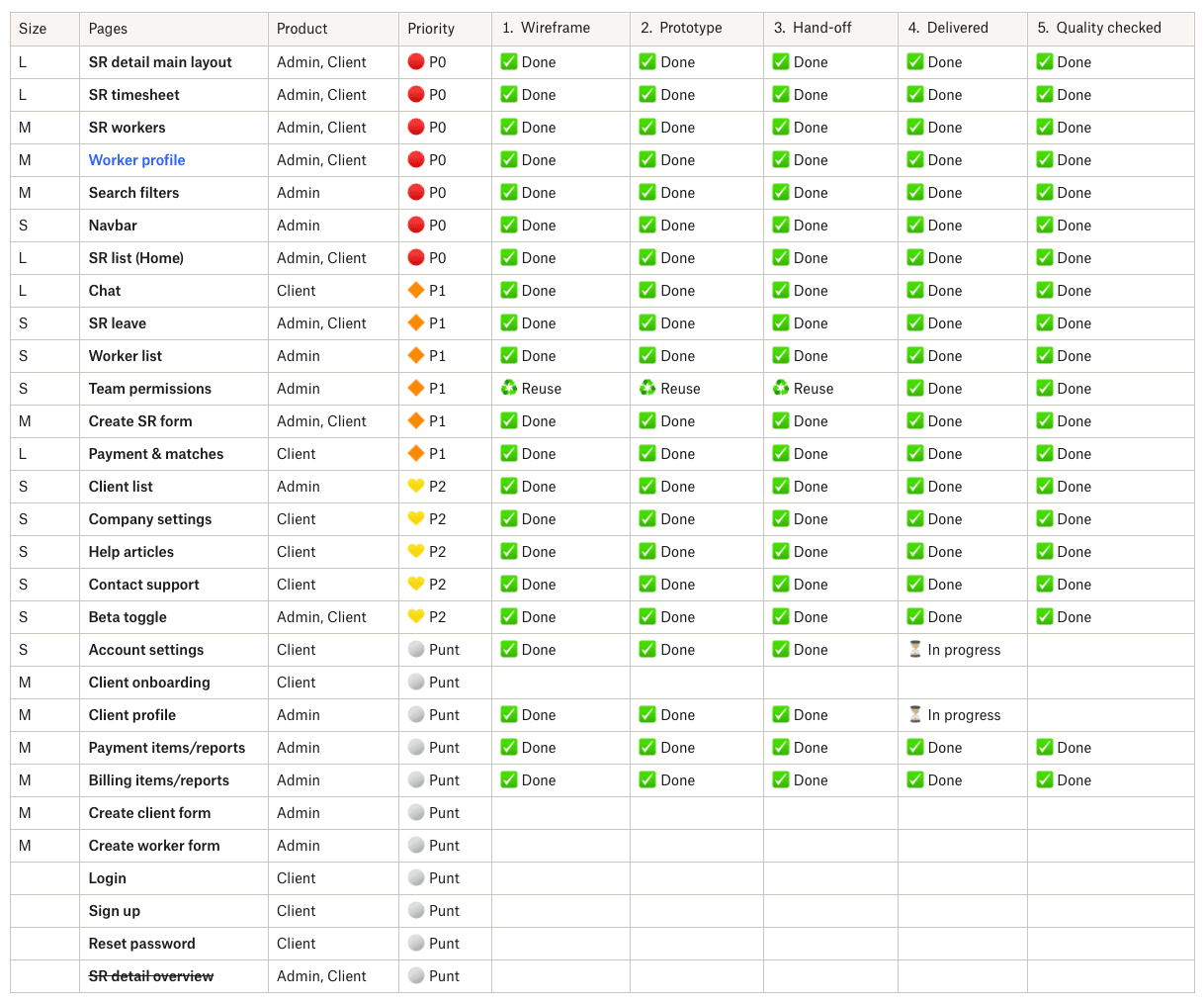
For my own project management of hand-offs, delivery and QA checks, I listed all pages and tracked their stages from wireframe through to shipping.

Final touches
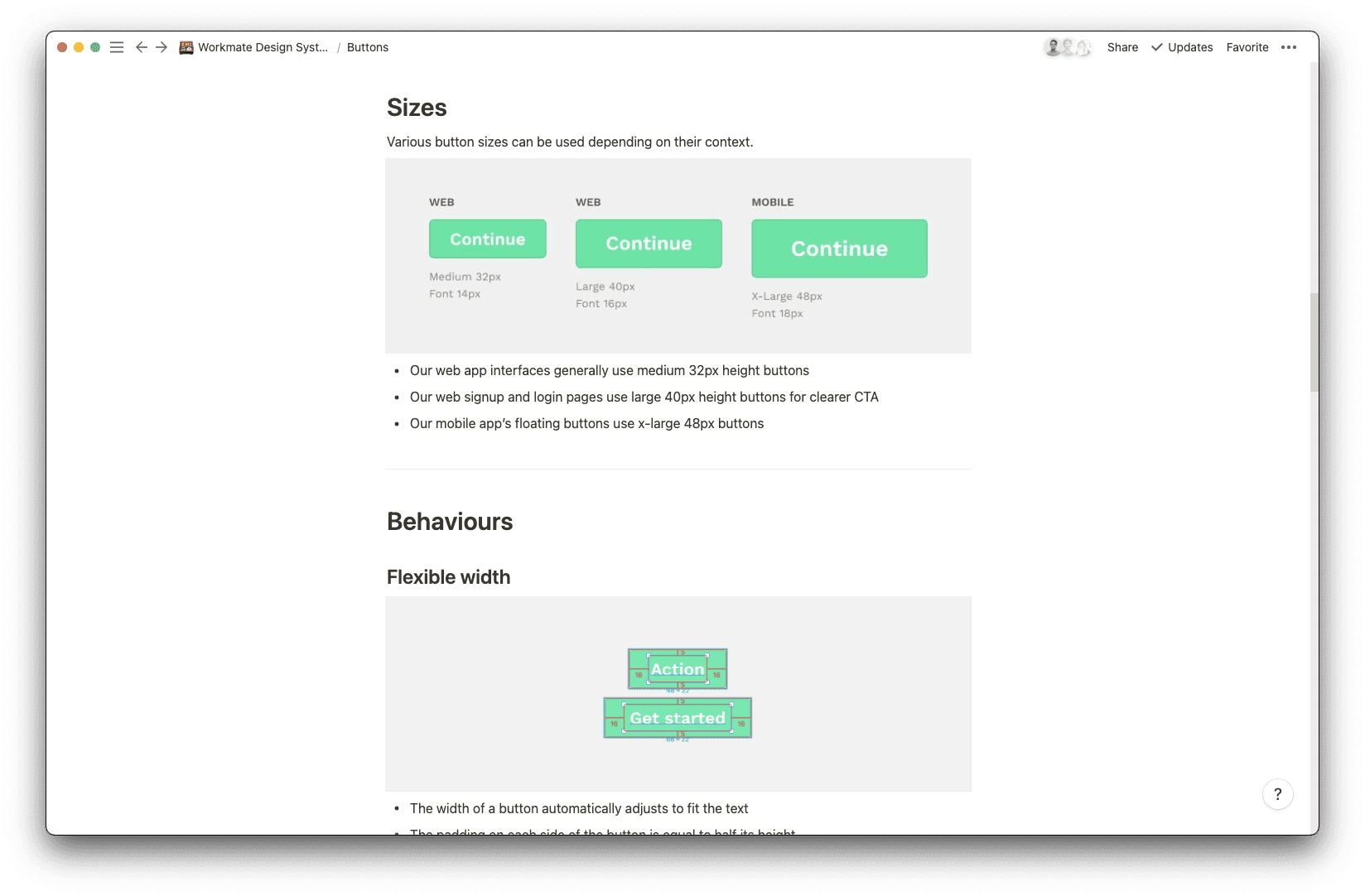
Component library
Up until this point, our platform was a hodgepodge of components from both React-Bootstrap and Ant Design. As a team, we made the decision to replace everything with the Ant Design library.
It made perfect sense for both Design and Engineering teams as button sizes, interaction patterns, and components were aligned. There was no logical sense in building and designing base components from scratch.

Styles
With the component library decided, I could use UI components based on Ant Design and easily style them according to our company’s brand and colours.
The iconography, rules of typography, and states were already defined by Ant, saving us time. Once I defined the styles and colours, I published them across our Figma workspace.

Prototypes
Combining the Ant UI kit and the master styles, the initial setup made the later design stages more efficient.
Creating the final prototypes for handoff became a matter of replacing wireframes with the corresponding hi-fi components and applying the styles to them.
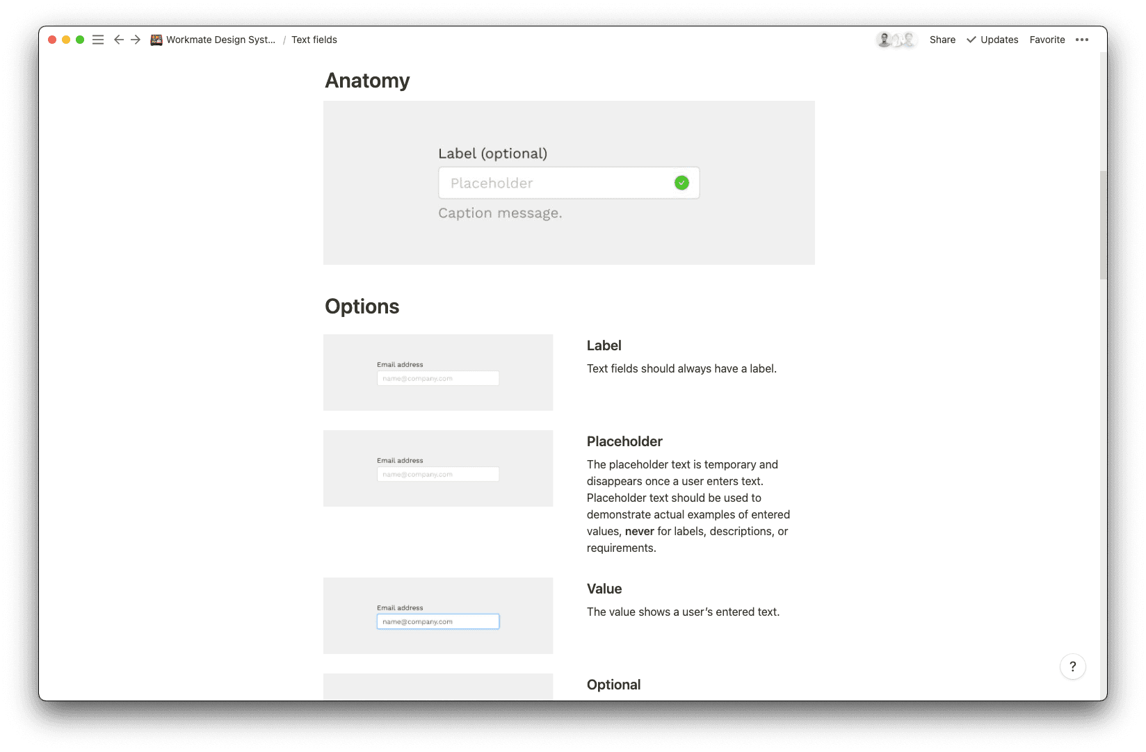
Design system documentation
A redesign across the platform will only be as effective as how well we maintain it over time.
Based on the final prototypes, I wrote and documented all of our styles, components, combined elements, states, and behaviours in a simple design system documentation.
This Notion wiki acted as the single source of truth for the design and engineering teams.

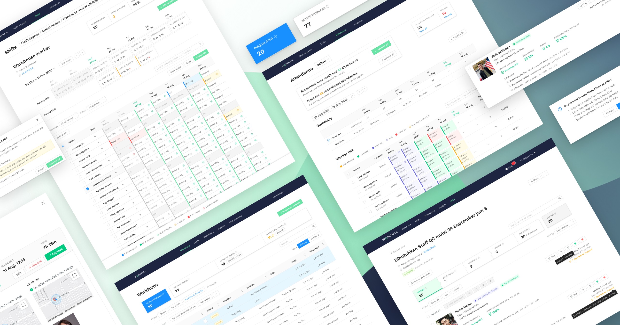
V1.0 of Workmate’s design system


Results
Here’s how we tracked a month after the project’s completion.
Reduced development time
Anecdotally, the engineering team gave feedback that they saved time in the later stages of development. They now had a coherent component library to reuse across features and pages. The design system wiki also allowed them to refer to styles and sizes at any time.
Fewer design enquiries
Personally, I also received fewer questions from the engineering team about small details like sizing and colour codes. When it came time for design QA, there were fewer change requests I had to file to the engineers.
Common language
The standardisation of colours and styles also allowed the engineers to align their colour names and type hierarchies within the codebase, making it easier for all engineers to access the same UI styles.
Scope of Work
Wireframing
UI/UX design
User testing
Design system
Project management
Product Design
Yung Tyng Lee
Maybelle Briones (Mobile)
Gunn Suppipat (Design System V2)
Product Management
John Reid
Development
Marx Low
Yejin Jung
George Ballard
Chief Product Officer
Hsu Ken Ooi
