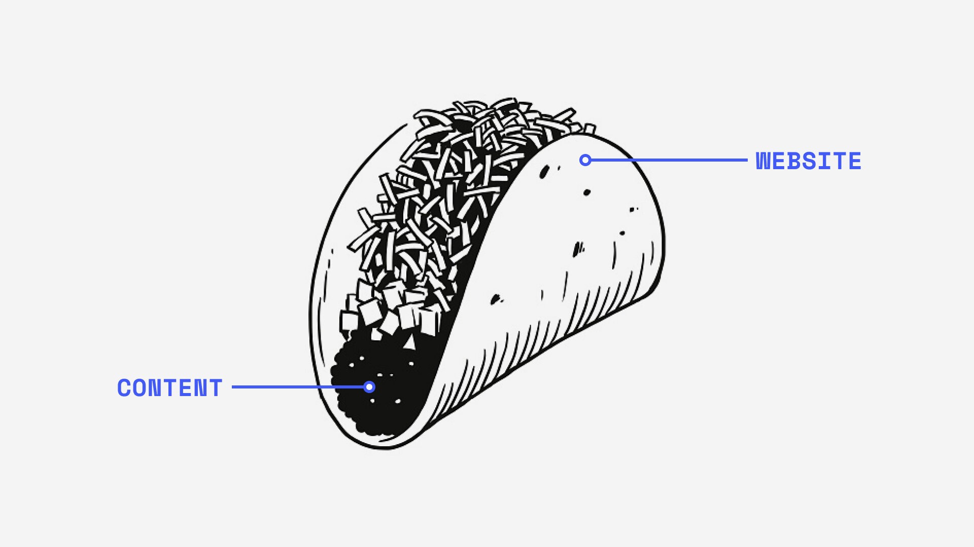
Does Your Brand Sear? — Brand Strategy Pt. 1

This article was originally published at gridhaus.com
Rather than getting in their face, the right way to be stuck on someone’s mind is to be… a real human being. In this series on brand strategy, we’ll walk you through Gridhaus’ process of building brands.
Have you recently rolled your eyes at another “A logo is not a brand” article? Yet, we die a little inside each time design Instagram accounts with cult followings post a single image of a logomark, and title it “XX rebranding by Studio XX” without further context.
It is for precisely this reason that this theme should be reiterated — your brand is more than your visual identity. If your business or organisation is struggling to build recognition and following, then you may need to do a lot more than hire a budget standalone ‘logo design service’.
For the seasoned designer, this topic may be a walk in the park so we can go in-depth and exchange perspectives over here. For the everyday user and business, our goal is to provide you with a deeper insight into how we’ve built brands and helped businesses move beyond the superficial visual consumption that our general creative industry is so accustomed to. We’re sharing with you our exact process of making strategic decisions in order to serve users better. This is so that you can make informed business decisions and conversations with your team or community.
Fair notice — this is a meaty article. Let’s preface it with a very clear definition of terms so that we are all on the same page.
———
Brand definition recognition
Branding
When we say Branding — we refer to a set of qualities, ideas, and attributes that we promise and deliver in all our user experiences — whether physical or any other interaction that a person may have with a company. Branding is not objective, instead, it’s feelings and philosophies. It’s the emotion and experience that customers get when they think of you, and then tell others about.
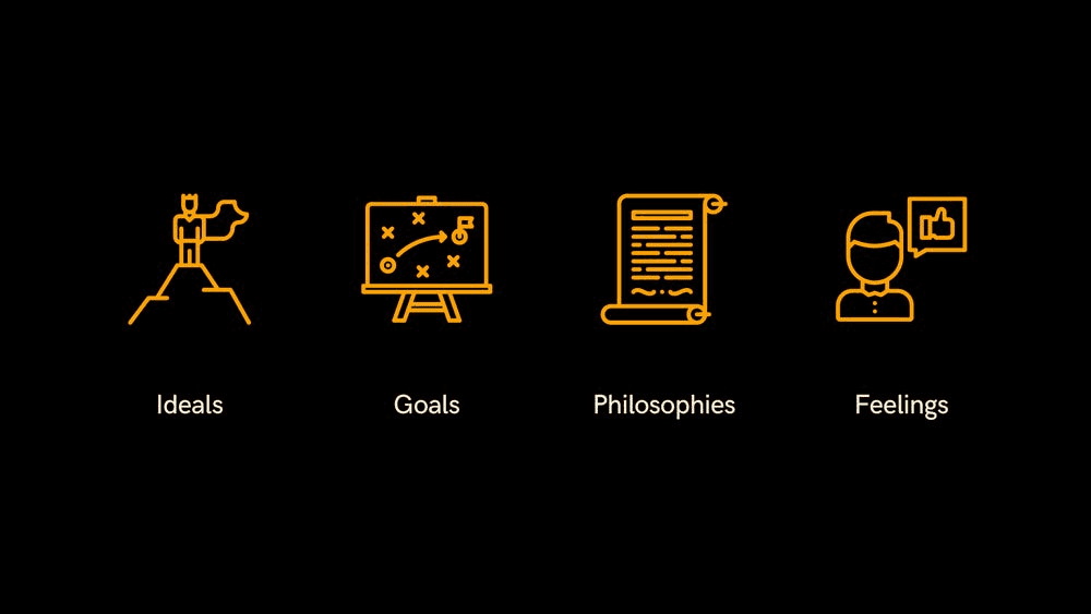
Icons by lastspark
The quality that makes up any company’s brand should inform the way a company presents itself and commits business — from high-level executives to management, to the smallest everyday interactions. It should be legible, clear, and well-articulated.
Identity
When we say Identity — we refer to a visual expression of the Brand through symbols, typography, colour, and layout.
Illustration by Fast Company
When we say brand, we don’t mean the identity — but who we are as a whole, and what customers think of us. When we say identity, it’s the identifiable or what we want to look like — logo, colours, components.
These definitions will be used consistently throughout this series on brand strategy. Let’s dive in.
———
➊ We remember people through feelings
Do you remember how you last recounted a memorable encounter with someone?
“It was such a pleasant and engaging experience speaking with him”
“Her enthusiasm is infectious! Everything is exciting and motivating when she’s here.”
“I really felt included. I’d love to spend more time with them!”
You might be familiar with the dinner-table game of “First Impressions”. It’s unlikely someone remembers their first time meeting you by your clothing. They recall their first encounter with you by what they felt of you, your mannerisms, attitudes, the kind of words you used.
This is the same kind of experience we want to give our users if we are to build a lasting relationship with them. Associating your product or company with a positive emotion that users feel will increase the chances of them returning to you. The more we provide users with a memorable & enjoyable experience, the more they feel valued, and the more likely they will advocate for us.
I myself enjoy an occasional stroll through a local Muji store, simply because I enjoy the calming atmosphere that their store and well-designed products create. This experience of unwinding is something I now readily associate with the brand. Naturally, I’ve amassed a line of their homewares that suit my needs (also a grasp at the dream of owning a Muji house), and whenever a friend expresses their search for a product, I’ll say “Muji has good ones!”

Successful brands are strongly tied to a customer’s feelings.
➋ Defining a brand’s attributes
With every business, the best and first investment is in knowing, developing, and improving ourselves. It is in having a clear understanding of ourselves that we will understand how to best serve and invest in others. This is in service to our users, that they are assured of a transparent and true intention of a brand they interact with.
Some of the brand pillars we contemplate include:
How do you describe yourselves in general? What do you aim to be?
How does your community describe you? The culture you’re trying to cultivate?
How would you describe your ideal user?
What experience do you want to create for your users?
What quantifiable value can you provide for them?
Here we define and prioritise single words that describe these aspects of the brand, among a few. Thinking of the brand as a person, how would you describe them?
Sometimes teams have the tendency to go negative, such as “indecisive” or “disorganised”. These should be positive. The goal is to express attributes based on an ideal of where we want to be in the near future. If someone describes a user as “disorganised,” we change it to “organised.” Reality happens in language first, so if we describe how we want to be as opposed to how we are, it helps us manifest that.
➌ The brand statement
Having defined a set of words that describe us really well, we have what we need to build an internal brand statement. This is a statement that vitally describes who we are, what we stand for, and what we offer. In other words, the purpose of why we exist.
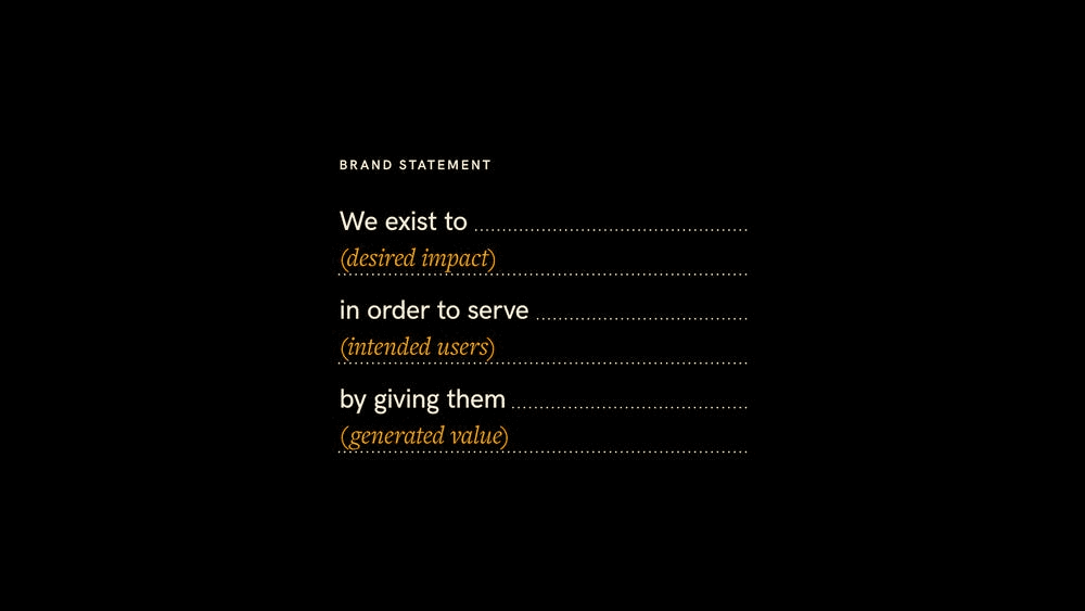
Example statement structure based on an exercise by IDEO’s Joe Brown. We use a similar framework that incorporates the discovered brand attributes.
Succinctness and clarity is the goal. If we can’t describe ourselves, it’s hard to imagine if our audience can understand us. Imagine a first date: If you can’t fully articulate what your interests and values are, or hold an engaging conversation with the right amount of words for that matter — your date will lose interest in you, fast. On the flip side, you risk inundating them with a spiel of your life story.
Hence, it is crucial that we always have this in writing. For an idea of how we’ve built a statement, here’s a recent example.
By stating clearly who we really are, it makes sure we’re always on track for the goals of our project — quality, customer acquisition, knowing what should be built, and knowing the business objectives we want to accomplish are tied to the design. The goal is not a fluffy “this looks trendy and amazing!”
➍ Re-enacting the desired feeling

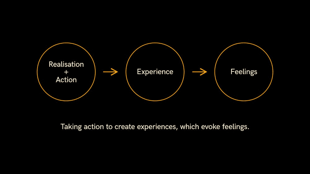
Reality starts with language, by turning words into action and living up to our claim. A visual identity alone is only one aspect, it can’t bear an entire brand’s responsibilities. It’s in the way we speak, the way we dress, or the way we interact with our customers. The best way to bring these experiences to life is through action.
Does your copywriting sound personable or robotic? How well and consistently does your outward-facing identity reflect the true internal value of your brand? Do your customers feel cared for and listened to when they meet you or contact you? Does the entire length of your digital & physical customer journey solve their pain points? Are you present with them at every step?
We’ll dive further into tailoring these solutions for our users in Part Two (coming soon). More about the execution will be carried over and explored in Part Three (coming soon).
———
Why use this process?
We use words to describe feelings
It’s as clear as it gets! Words are the first line of communication, and they are especially crucial during preliminary project stages between designers and clients. The lack of clear definitions and parameters at the start is the main cause of most project breakdowns.
Designers, we’re familiar with being stuck in the cycle of countless sketch concepts, endless draft revisions, ‘Styleguide-Final-v4.6.2.indd’, and “I don’t like this shade of blue, please use the colour my nephew chose” at some point in our work.
By translating feelings into words and unanimously prioritising their importance, we eliminate this old, time consuming (and illogical) process altogether. Take for instance —
“We’ve described our users’ experience of the brand as calming and comforting, like coming home from a long day and being wrapped in a warm blanket. As demonstrated in these images, we find a deep shade of blue paired with warm hues of greyish tan can embody this feeling.”
“I like that. It’s a sense of familiarity, yet also evoking senses with texture and warmth. There’s an idea that those elements were carefully selected to create that environment, which is what we want to give to our users. However, I’m concerned if this could risk being perceived as a cold palette. Could we pair them with some obvious warm colours?”
“That’s a great point. Imagine sitting by a fireplace. We’ll explore what other accents can complement this primary selection.”

From pointing at each other to walking together, pointing towards the goal.
The discussion naturally moves from subjective personal preferences to an objective and informed process. It’s now about figuring out how our decisions affect our users. Decisions are now made on solid premises, following an “if this, then that” logic. Understanding the brand attributes gives us a set of very specific reference points we and our clients always point ourselves to, instead of pointing at each other.
Acceleration is the game, consensus is the aim
I. Shiny Object Syndrome
“Ooh my competitor has this feature, I like these colours, I like these graphics — so I’d like to have these. Can you do that?”
In this case, neither teams have a basis on whether it is suitable for and represents a client’s brand. It is also, plainly speaking, a waste of everyone’s time and resources when subjective indecisiveness strikes.
We start by objectively defining who we are. By knowing ourselves really well, we won’t let our brand or identity be defined by a ‘shiny object’ or what others have done for their own unique use cases.
II. System for consensus
When we facilitate these frameworks with our clients, we arrange to have as many of the C-Suite in the same room with other primary decision-makers. This is to establish agreement from all key stakeholders on any decisions made — and this, without fail has accelerated our projects.
It’s been a long time since we’ve had to deal with unreasonably long email threads addressed to the executives, cc-ed to our team, their marketing & tech department, (and possibly their new intern). What could take two weeks for the client-side to decide on is established within hours.
In return, our clients have the absolute guarantee that we’ve listened to and understood exactly what they’ve described, and their business goals will be deeply tied into the designed end-product.
In the end, once your users clearly understand who you are and how you can solve their needs, you’ll know that your brand and identity are successful.
———
References
The Brand Gap, Marty Neumeier
CORE 1.9, Jose Caballer
Recommended reading
This article is Part One in a series about Brand Strategy. Check out the links below for parts two and three, and our list of recommended readings.
Your brand is in their hands — Brand Strategy Pt. 2 (Coming Soon)
Planning for the big day — Brand Strategy Pt. 3 (Coming Soon)
No one cares about your logo, Jon Hollamby
There’s more to branding than a logo, Michael Johnson
The Brand Gap, Marty Neumeier
The Win Without Pitching Manifesto, Blair Enns
Creative Strategy and the Business of Design, Douglas Davis


