Pixels to Product: Simplifying a Portfolio Design (Part 1)
Welcome to the first part of a three-part series exploring the journey of designing and maintaining a portfolio as a product designer. We’ll trace the path from early digital designs to the ongoing challenge of keeping a portfolio relevant. In later parts, we’ll delve into effective storytelling and scaling your portfolio as your career progresses.
Every designer knows the challenge of maintaining a portfolio. It’s that project we know we should tackle, but often postpone. Whether due to time constraints, uncertainty about the effort involved, or a sense that it’s never quite finished right before a job application, it’s like a persistent source of mild anxiety for us.
Two years ago, I made an unconventional decision: I turned off my portfolio.

I disabled the auto-renewal on my Squarespace account, letting my website disappear. It had seen little use while I focused on my work at Gridhaus. This hiatus from maintaining a portfolio coincided with my deeper exploration of product design, a shift from my roots in visual design. The transition, while significant, helped me draw connections between these disciplines and gave me a new perspective on my design journey.
The portfolio evolution
2007: First steps
In 2007, at 15, I created my first website. Full of youthful optimism, I hoped to reach 1,000 hits¹. Little did I know how quaint that number would seem in the future. Inspired by sites like Cool Hunting and Scott Hansen’s ISO50, I aimed to create something both simple and impactful.
With a first-generation broadband connection and an iMac G3, I dove into Blogger. Its basic single-column layout became my canvas. I spent countless hours after school decoding CSS and HTML, guided by W3 documentation. Through this process of trial and error, I developed my skills, eventually designing custom blogs for friends and events.
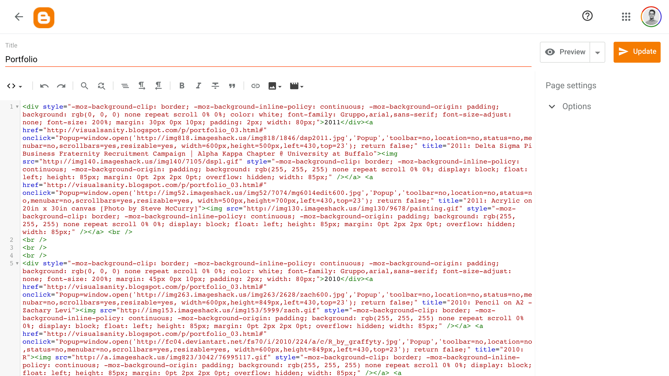
Does this count as a code hygiene nightmare?
Amidst the dreariness of the Malaysian school curriculum, this self-taught journey into web design was exhilarating, especially in contrast to the standard computer classes that barely scratched the surface of basic office software.
2010-2013: The platform era
As I entered college in 2010, my hands-on coding decreased. By 2013, I had launched my first Squarespace site to showcase my visual design work. This shift from hand-coding to using platforms mirrored a broader industry trend towards user-friendly website builders.
2019: The portfolio pause
By early 2019, as I immersed myself in product design, my Squarespace portfolio felt increasingly irrelevant. The decision to disable it marked a shift in both my career and my approach to showcasing my work.
Rediscovering portfolio design
After a two-year break, I found myself contemplating what insights to share. The process of reactivating my website to migrate old articles sparked new inspiration. I began sketching wireframes for a revamped portfolio, driven by a clearer sense of purpose.

The website is now quite different, but these help with making early decisions.
My goals were straightforward:
Improve clarity for visitors
Highlight the design process and storytelling
Create a simpler, more intuitive navigation
This approach led to:
More engaging, conversational content
Consistent design elements
A streamlined, user-friendly navigation system
I aimed to strip away unnecessary clutter, convoluted language, and overwhelming details. The new site would serve as a simple framework for curating my stories and insights.
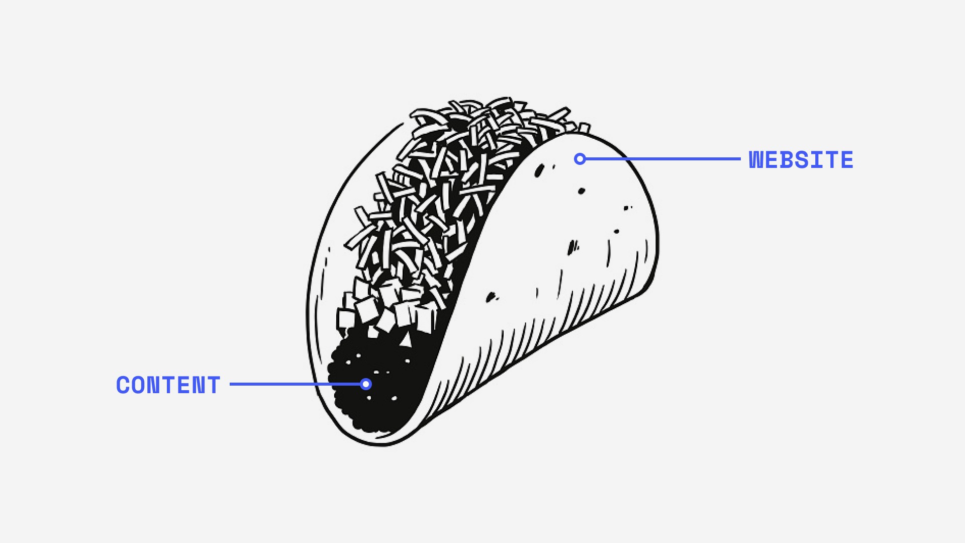
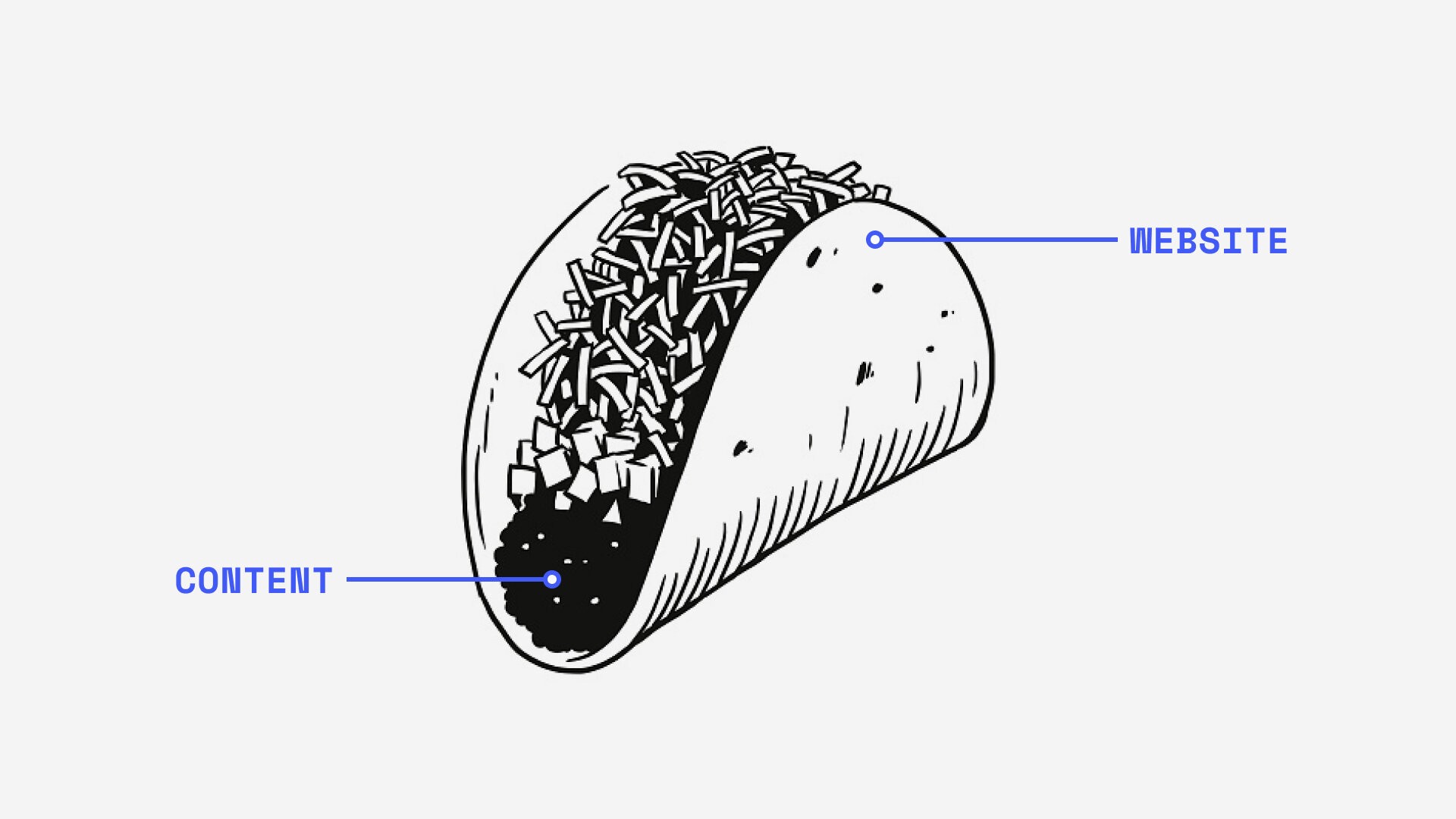
Illustration of a personal website, oversimplified.
The pursuit of simplicity
Ironically, the quest for simplicity often leads down complex paths. My experience with Squarespace illustrates this paradox:
I renewed my annual subscription.
Discovered my chosen template wasn't compatible.
Spent hours navigating their help centre.
Learned my site was on version 7.0, but I needed 7.1.
Found no direct upgrade path between versions.
Cancelled my subscription to start fresh with 7.1.
Worried about getting my $144 refund.
Expressed my frustrations to customer support.
Finally launched a new 7.1 site.
Backed up old content to Notion and Medium.
Lost $10 in the currency exchange during the refund process.
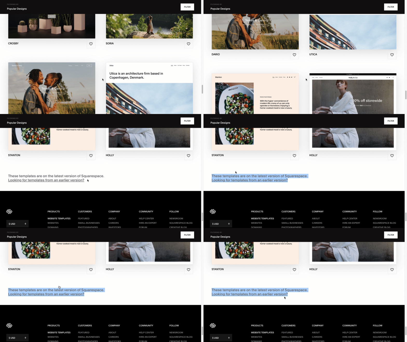
A key piece of information in the most hidden of places. Commence ✨ cursor trashing ✨
This experience reinforced a key lesson: the path to simplicity is often anything but straightforward.
I explored alternatives like Webflow and Wix but found they also required significant setup time. The idea of using Notion as a CMS with Super was appealing but didn’t seem sustainable long-term. Despite taking a SuperHi course, I lacked the confidence to build my own site from scratch.
In the end, I returned to Squarespace. Despite its limitations, it offered a balance of user-friendliness and functionality that met my needs—a practical example of compromising between simplicity and capability.
Reflecting on the digital revolution
Looking back at 2006–2010, we were on the cusp of a digital revolution, though many of us didn’t fully grasp its scope. New platforms like Twitter, Tumblr, Pinterest, and Instagram were emerging, while Facebook began to eclipse earlier favorites like Friendster and MySpace.
For most, this digital surge was more novelty than career path. The tech industry, startups, and Silicon Valley seemed like distant concepts. Coding and product design were not yet widely recognised as viable career options.
During this transitional period, my peers and I found ourselves in a unique position. The generation before us either seized these new tech opportunities or created them, while those after us would grow up seeing tech as a natural career path.
Guided by traditional values, many of us pursued conventional careers in law, medicine, accounting, or engineering². My focus on design was somewhat unconventional, influenced by my family's background in advertising. Even so, my understanding of design was still rooted in the soon-to-be-outdated norms of the local advertising industry.
Tech remained a mystery, especially in our region. To my knowledge, only my co-founder made an early transition into tech, teaching himself programming while studying bioengineering. It’s nice to see the occasional update on more peers entering product and tech.
Key insights
Reflecting on this journey, several key points stand out:
Simplicity takes hard work: Creating a simple, effective portfolio can involve unexpected challenges.
Continuous evolution: Our portfolios, like our careers, need to adapt to changing technologies and personal growth.
Personal narrative matters: Your unique experiences set your portfolio apart.
Embrace change: Be open to new methods and platforms as the digital landscape evolves.
Balance technology with purpose: Choose tools and designs that meet your needs without overwhelming you with unnecessary complexity. It makes maintenance that much easier.
Looking forward
A decade later, I find myself revisiting the basics of website creation³. With more experience and a clearer vision, I’m drawn to the simplicity I once knew: minimal subscriptions, straightforward technology, focused on content. It’s no surprise that figures like Paul Graham have maintained remarkably simple sites for years.
The tech landscape has changed dramatically. Coding in 2021 feels more daunting than it did in 2008. The choice seems to be between investing time in learning or money in outsourcing.
Yet, I hope to reconnect with the fundamentals, enough to design and build a functional website. While I regret drifting from my initial grasp of simplicity, I see each past decision as a learning opportunity. If a graphic designer can navigate from difficult clients to running a design business, perhaps it’s not too late for a product designer to revisit website development? One can hope.
As we continue this series, we’ll explore effective storytelling through your portfolio and how to scale it as your career advances. Stay tuned for Part 2, where we’ll dive into the art of writing and narrative in design portfolios.
———
Notes
¹ Revisiting Blogger, I noticed Google’s updates, including new analytics tools. My old blog had accumulated 32,000 hits before retirement. While some might be from bots, it’s not a bad count for a 15-year-old who knew nothing about web traffic and funnels.
² Looking ahead, I hope the common asian parental command of “tuition, swimming, piano lessons, and a set career path” might evolve to become “How about trying some programming?”
³ This phrase is borrowed from Frank Chimero’s article. His 2018 piece offers a more comprehensive perspective on this topic. I recommend exploring it, along with his series on redesigning his website.
Edit (2024): I eventually grew tired of Squarespace’s limited design customisation options and have since transitioned to Framer.


